Now we are into the Chinese New Year season with a lot of celebration, family gathering and entertaining happening almost every minute, even in the far far away island of Australia. 😛
Being a marketer from an Asian background, I felt nearly flattered while noticed so many brands launched their CNY theme editions to cater to the market and special festival season. It is rather facilitating to see how the Asian tradition is infused into the creation of those “limited editions” of western brands. It is truly encouraging to see an increasing number of brands start to invest to understand local culture and try to stay close to the local market.
I would like to offer my personal opinions on them, as a marketer who, fairly to say, understand bit cultures from east and west. To fully examine the cultural challenge behind, my preliminary focus, the examples I shared here, will be western brands.
To start, though the enthusiasm of embracing local culture to stay relevant to the market and consumer, unfortunately, the majority of them, in fact, haven’t done a job that is good enough, when takes into consideration into their global reputation and rich resources available.
- Overly simple or too “light” on CNY
It is not to say CNY has to be complex or overly rich. But the same as the case in Xmas in western culture, in which season the whole family won’t celebrate the Xmas Eve with only one dish of salad, it is inappropriate to only get one design element to cover the theme. It is too shabby.
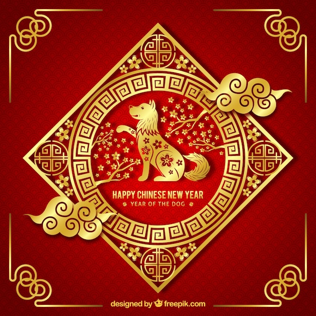
There are many elements or symbols that could be used for this festival season, such as lanterns, firework, flower, red packets, images of the zodiac animals…each symbol stands for certain wishful thinkings or implications like flowers for prosperity, bamboo for promotion etc. It shouldn’t be a challenge at all.
Look at this,
and this

However, some brands think differently.
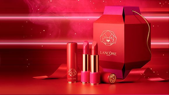
Below an example from Lancome. It is not a very bad design but the expectation is higher than what we see here. The red color is on the theme, yet only one very abstract dog image as the key visual. Subtle… Have to say, it is quite an easy money for the designer: P
And Lancome is not alone, Armani

Similarly for LV, it is rather a “dog” version instead of a “CNY” version.

There may be some “excuses” for above designs, simplicity is beauty, not overtone the brand cue, bla bla….
Below one, even as cheeky a market as Mark Yan, which is me, can’t figure out a single reason why design in that way…
Here you go, the legendary red packets from Dior, on which incorporate a Simple Chinese Character ‘狗’, meaning “dog”. I was rather shocked by the “disruptiveness” then. I was thinking it must be a joke…

Besides the “simplicity”, this one also has a second issue, which sometimes can be fatal…
2. Wrong code or mis use of the code
“狗” in itself is not an issue, but it is not supposed to use alone under such occasion. To hand out the red packets like that is like to call the receiver “dog”, which, in oriental culture, is not a nice thing. Indeed very offensive…
Below Addidas Originals shoes used too much white color which is not a “common” practice, to say the least, in CNY, and the double happiness symbol, the round shape icon on the back side, is actually exclusively used in weddings.

Well, share a joke here. I remembered once upon a time, my agency proposed to have a team of girls, each holding a white color lantern, to navigate the whole team of my employment company to the annual conference venue. The conference was held in CNY time and the agency believed such color will be very “eye-catching to the public”, “elegant”, “premium/luxury” with the highlight was the lantern to “tie nicely into the festival season”… I said to agency “I didn’t plan to die, but to use your idea, you have to kill me”. –Funerals are the only occasion white color lanterns to be used!
3. Impair brand aesthtics and lack of integration
The design need to be celebrating, cheerful, cultural relevant and unique to the season yet also need to sit nicely with the existing brand DNA, aesthetic principles and design code. Especially for luxury brands, there should be very sophisticated and comprehensive thinkings here.
Burberry, a brand I loved so much…the classic plaid… really doubt whether the “福” FU character, meaning happiness, there fit the overall design.

The LV dog version bag above has the same issue. Also, Gucci,

And watches probably the worst category, so many of them just get a dog onto the plate…

Join the list, Estée Lauder

Maybe the champion goes to CK. The left one is its CNY edition. You can’t be Parvenu enough. Ok, You win! It successfully exceeds my worst imagination of such!

I felt both amused and astonished while featuring above. Been amused by these rather silly designs, some really like the work from a junior designer only know basic skills of photoshop and have thoroughly no design thinking. Been astonished for the fact that such designs can be released, understanding how rich the resources those companies usually own and how complex the approval process of artwork could be in such companies.
To avoid such silly mistakes, I would suggest below:
- Explore deeper and wider into the culture and really understand the essence and sophistication of those traditions and its cultural context.
- It is a complete perception and a holistic picture, rather than individual bits and pieces. It is not red/gold color only, it is not the zodiac animal only, it is not the Chinese characters only, although each of them forms an unmissable part of the whole setting. It is not to simply add up, it is to integrate, harmoniously.
- Learn from the market and listen to the consumer. Understand what works and what not. study those best practice. Be open and be inclusive.
- Though festivals indeed set up the tone, don’t let the festival element override the brand DNA and design aesthetics, it will sacrifice the brand too much and risk the brand for being lost. Equally, don’t be too light for the festival theme. It is 1000 times harder to implement than to say it, but brands have to find a balanced and harmonious way.
- Do engage local team to have a gate keeping process to avoid stupid mistakes.
(or, you can hire me…:P)
The last part, I would like to share some great examples to feast the eyes…
Coke, actually not as good as I have wished. Quite safe designs, somewhat plain, not eye-catching enough. I also challenge the visibility of brand logo.

Pepsi focus on dog with the play. Modern and vibrant. With a disadvantaged base color of blue, actually did a good job. 
Below is for HK market, my favourate among the 3. 
Suntory beer, Japan market, very good design. 
Australia market, Penfolds immediately jump into my mind. Around 2 years ago(?) they introduced the CNY limited edition, and used red color soft wrapping tissues, very on theme. This year’s version is also great example!

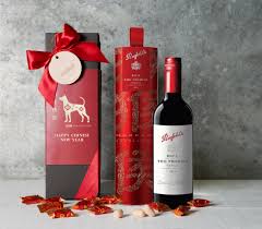
Believe such success of Penfolds being jealous by a lot, such as Wolf Blass, who has an idea this year. Good usage of golden color cue. 
Chobani Yogurt launched a “Mandarin” version. I love the wit… Design is ok being first time into this.


****************Special attention pls*********************
As you know I always save the best for the last, so allow me a little bit selfishness to save this special spot to my favorite Hennessy.
Here to feature the limited edition for China market…very celebrating color red making it a great gifting option. (btw, they should also launch a CNY version of Hennessy Classivm)
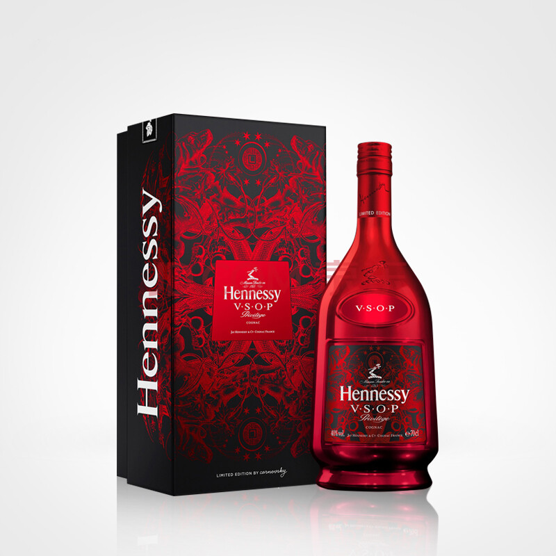

I believed AUS has below item, celebrating Hennessy VSOP’s 200 years anniversary, on market now, stunning!!!

The CNY theme poster and instore visibility, created by Chinese artist Shan Jiang, whose visual creation perfectly portrays the spirits of Hennessy and captures the excitement and emotion of the Chines New Year. The piece includes various auspicious symbols such as sailboat, dog, Goddess, peony, wishing lanterns, firework, cloud and more.


Thank you for the reading. I hope you enjoy it. Should you have any thoughts or questions, please feel free to reach me or leave your comments.
Here I wish you a happy Chinese New Year (Gong Xi Fa Cai)
Note: Images are from internet. Please let me know should there be right issue.


